ChartJs Visualization Library - A Detailed Walkthrough

Chart.js is simple yet flexible JavaScript charting library for the modern web. Chart.js comes with a sound default configuration, making it very easy to start with and get an app that is ready for production. Chances are you will get a very appealing chart even if you don’t specify any options at all. Chart.js renders HTML5 canvas, so it works for a large dataset computations. It comes with built-in typescript bindings and provides integration with react, vue, svele and angular. Chart.js is open source and available in the github repo.
In this article, we will learn about how to create Bar Chart, Area Chart, Bubble Chart, Doughnut and Pie Charts, Line Chart, Mixed Chart Types, Polar Area Chart, Radar Chart, Scatter Chart, Cartesian Axes, Category Axis, Logarithmic Axis, Radial Axes, Labeling Axes, Styling using Chart.JS.
Getting Started:
There are different way of adding jquery plugin to our project.
1. Install Chart.js using npm
If you are using npm (Node Package Manager) in your project, you can install Chart.js easily by running the following command in your terminal or command prompt:
npm install chart.jsThis will download and install the Chart.js library into your project
2. Include Chart.js using CDN
Alternatively, if you prefer using a Content Delivery Network (CDN), you can add the following script tag in the <head> section of your HTML file:
<script src="https://cdn.jsdelivr.net/npm/chart.js"></script>This will include the Chart.js library directly from the CDN.
3. Download from GitHub
If you want to manage the library manually, you can download the latest version directly from the Chart.js GitHub repository https://github.com/chartjs/Chart.js. Once downloaded, extract the files.
If you downloaded Chart.js from GitHub, navigate to the Chart.js directory using the command line and run the following commands to build the distribution files:
This will generate the necessary dist files in the Chart.js directory.
npm install

npm run build
Add the following script tag in the <head> section of your HTML file to include Chart.js:
Replace "path/to/chart.min.js" with the correct path to the Chart.js file in your project.
<script src="path/to/chart.min.js"></script>
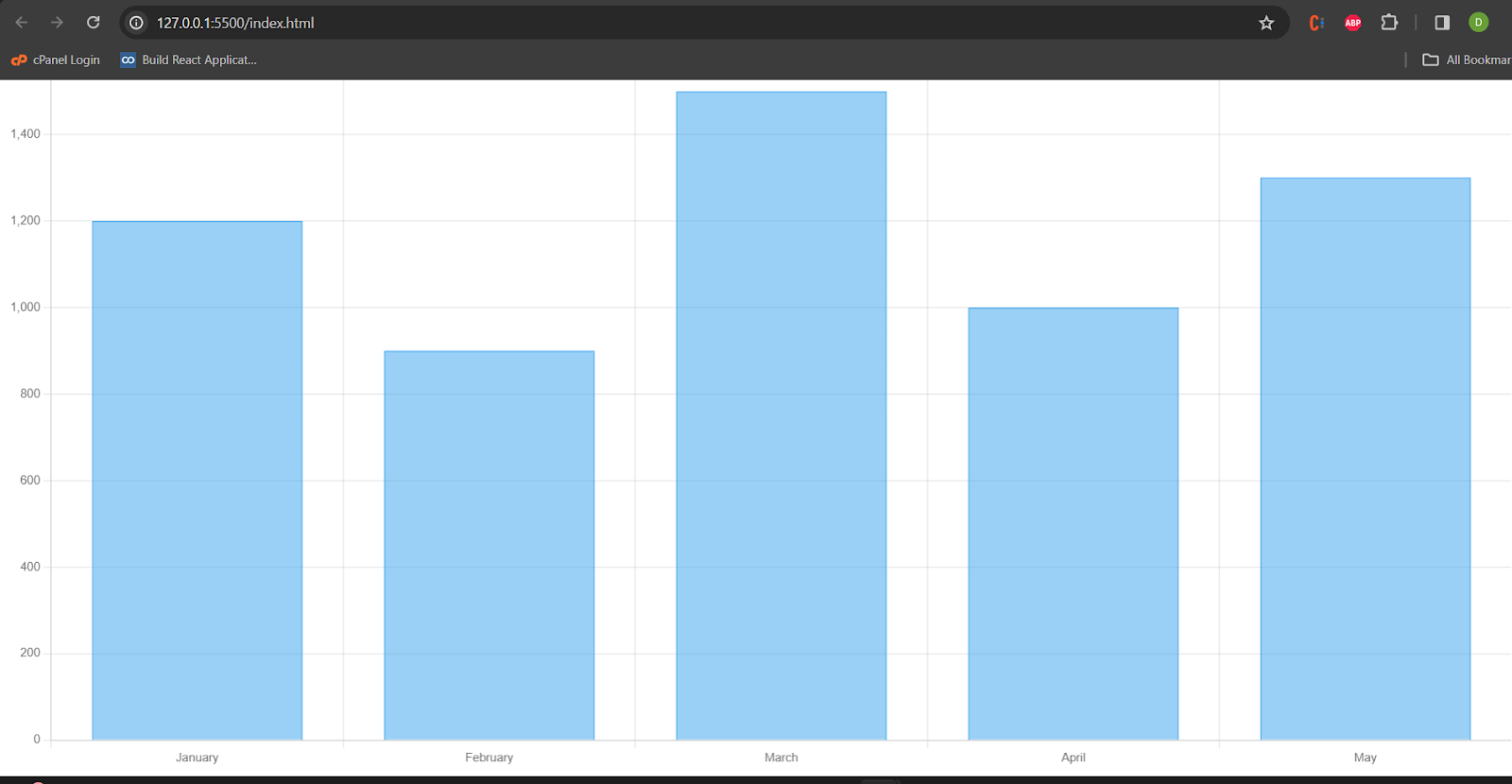
Bar Chart
We need to provide the labels and datasets for the bar chart. Now create the chart object with the document element and data.
<script>
  const data = {
  labels: ['January', 'February', 'March', 'April', 'May'],
  datasets: [{
    label: 'Monthly Sales',
    data: [1200, 900, 1500, 1000, 1300],
  }]};
const ctx = document.getElementById('myChart');
const myChart = new Chart(ctx, {
  type: 'bar',
  data: data,});
</script>
 <canvas id="myChart"></canvas>
Bar chart will rendered as below:
Below are the configuration for the charts:
Chart Type and Data:
type: Specifies the type of chart (bar chart, line chart, pie chart, etc.).
data: Contains the dataset or data source for the chart.
Layout and Styling:
layout: Defines the overall layout properties like width, height, margins, etc.
style: Specifies the visual style of the chart, including colors, borders, and other styling options.
Axes Configuration:
xAxis and yAxis: Define properties related to the x and y axes, such as labels, tick marks, and scaling.
Legend Configuration:
legend: Controls the appearance and position of the legend, which explains the meaning of different elements in the chart.
Tooltip Configuration:
tooltip: Configures the behavior and appearance of tooltips that provide additional information when hovering over data points.
Title and Labels:
title: Specifies the chart title.
labels: Contains properties related to axis labels, data point labels, etc.
Animation and Interaction:
animation: Configures animations for various chart interactions.
interaction: Defines how users can interact with the chart, such as zooming, panning, etc.
Responsive Design:
responsive: Handles the responsiveness of the chart to different screen sizes.
Plugins and Extensions:
plugins: Allows the integration of additional plugins or extensions to enhance the chart's functionality.
Below bar chart is created with width, height and given the x-axis and yaxis title. Als provided the tooltip and animation for the chart.
 const ctx = document.getElementById('myChart');
  new Chart(ctx, {
  type: 'bar',
  data: {
    labels: ['January', 'February', 'March'],
    datasets: [
      {
        label: 'Sales',
        data: [50, 80, 65],
        backgroundColor: 'blue',
      },
    ],
  },
  layout: {
    width: 800,
    height: 400,
    margin: { top: 20, right: 30, bottom: 40, left: 50 },
  },
  xAxis: {
    title: 'Month',
    tickInterval: 1,
  },
  yAxis: {
    title: 'Revenue',
    tickInterval: 10,
  },
  legend: {
    position: 'top',
    display: true,
  },
  tooltip: {
    enabled: true,
    format: '{label}: {value}',
  },
  animation: {
    duration: 500,
    easing: 'easeInOutQuart',
  },
});
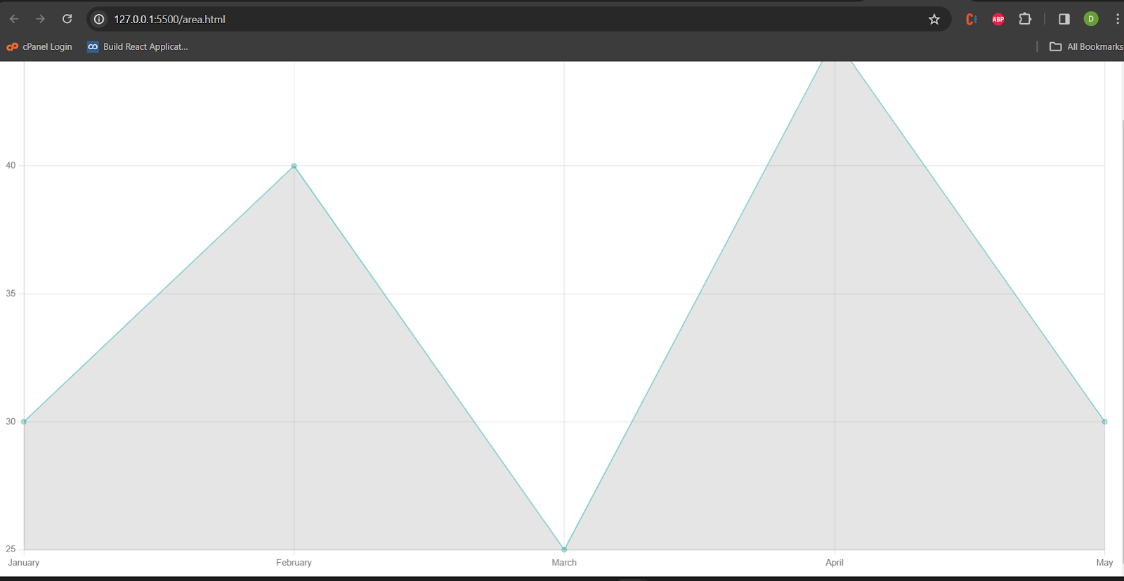
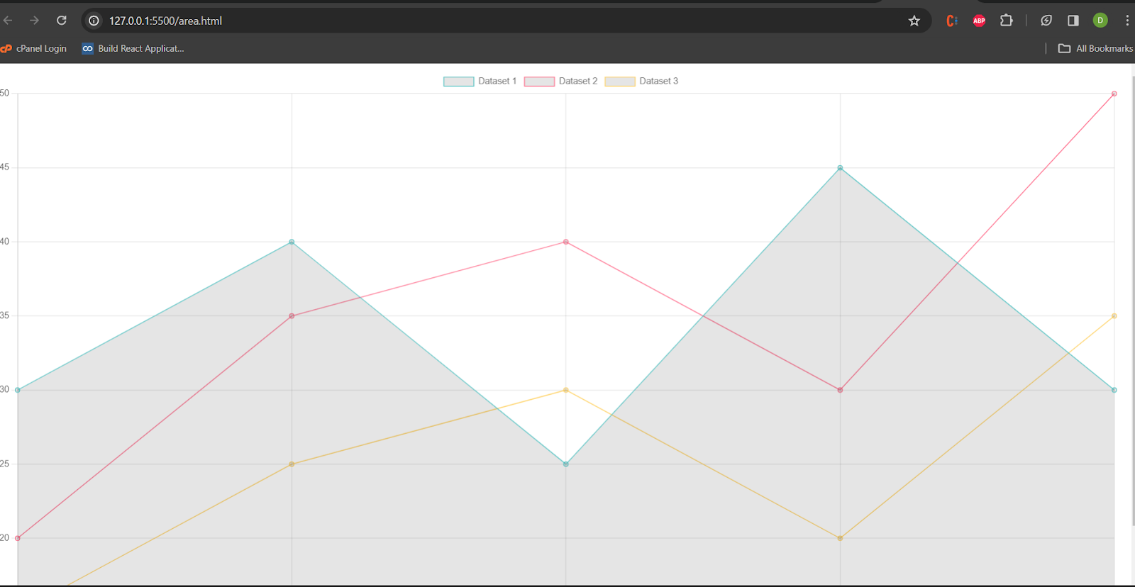
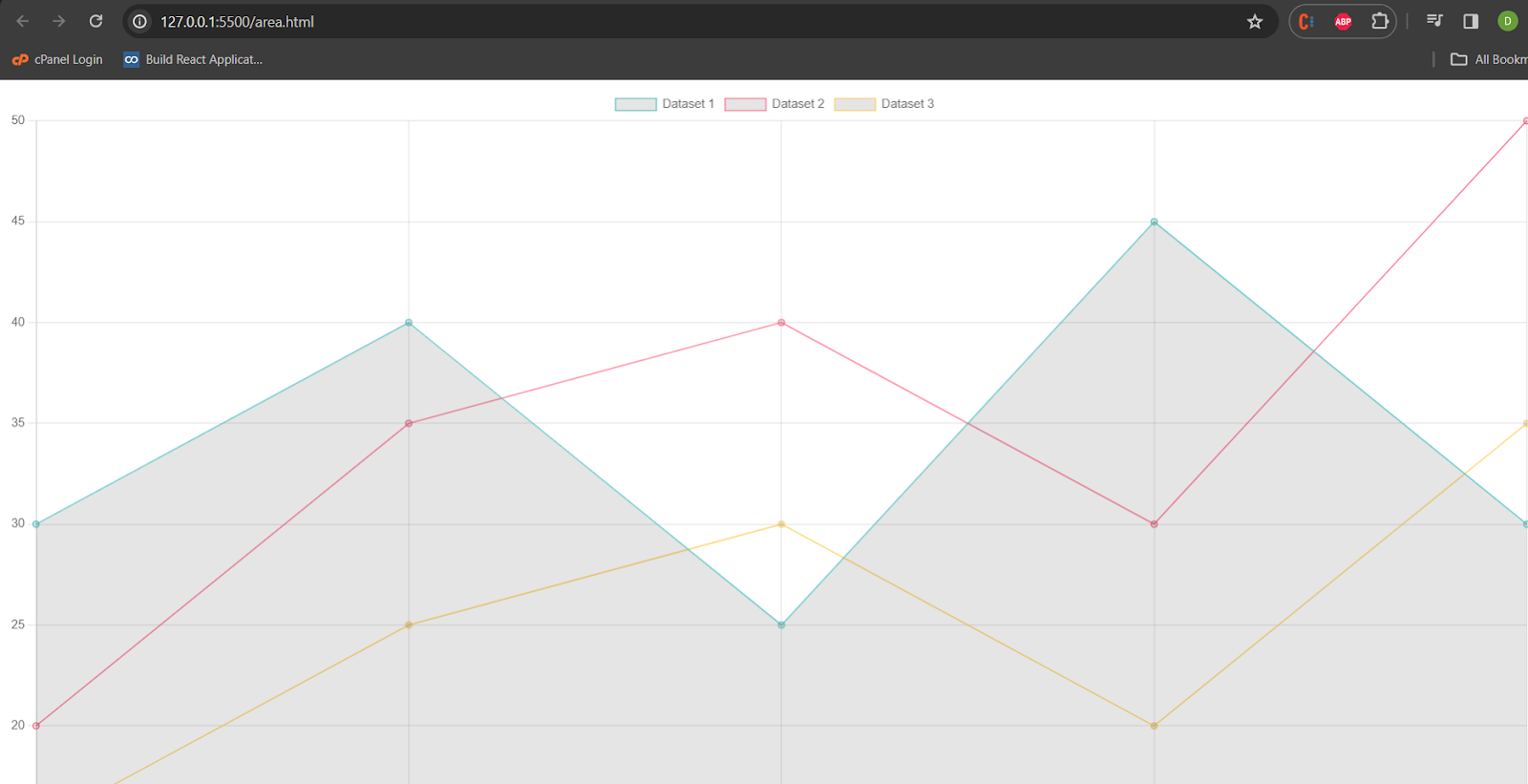
Area Chart
Area charts display quantitative data over a continuous interval or time span. The area between the line and the axis is filled to represent the cumulative value of the data points.
 const areaData = {
  labels: ['January', 'February', 'March', 'April', 'May'],
  datasets: [
    {
      label: 'Dataset 1',
      data: [30, 40, 25, 45, 30],
      borderColor: 'rgba(75, 192, 192, 1)',
      borderWidth: 1,
      fill: 'origin',
    },
  ]
};
const areaCanvas = document.getElementById('areaChartCanvas');
const areaChart = new Chart(areaCanvas, {
  type: 'line',
  data: areaData,
});
Area chart is given below:
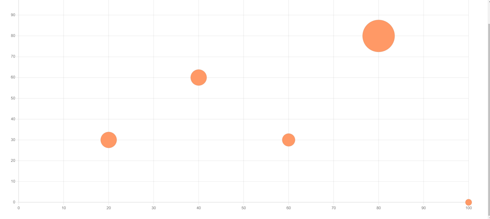
Bubble Chart
Bubble charts represent data points with circles, where the size of each circle indicates a third dimension (e.g., population or revenue), in addition to the x and y coordinates.
 const bubbleData = {
      datasets: [{
        label: 'Bubble Chart Example',
        data: [
          { x: 10, y: 20, r: 15 },
          { x: 30, y: 40, r: 25 },
          { x: 50, y: 30, r: 20 },
          { x: 70, y: 10, r: 30 },
        ],
        backgroundColor: 'rgba(75, 192, 192, 0.5)',
        borderColor: 'rgba(75, 192, 192, 1)',
        borderWidth: 2,
      }]
    };
    const ctx = document.getElementById('bubbleChart').getContext('2d');
    const bubbleChart = new Chart(ctx, {
      type: 'bubble',
      data: bubbleData,
      options: {
        scales: {
          x: { min: 0, max: 100 },
          y: { min: 0, max: 50 },
        },
      },
    });
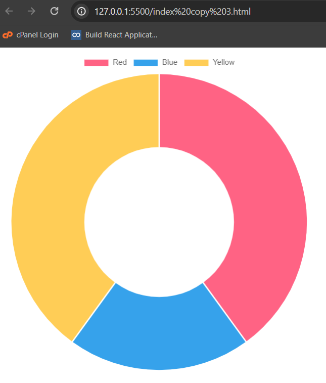
Doughnut and Pie Charts
Pie charts represent data in a circular graph where each slice represents a proportion of the whole. Doughnut charts are similar but have a hole in the center.
 const config = {
  type: 'doughnut',
  data: data,
};
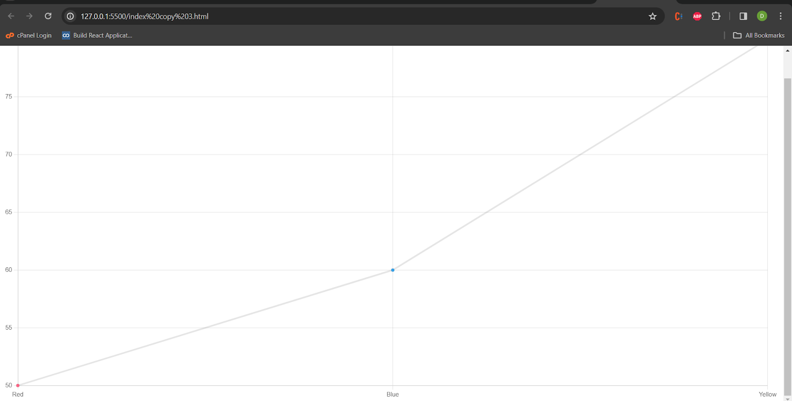
Line Chart
Line charts connect data points with straight lines, making them useful for displaying trends over a continuous interval.
Use Case: Showing the progression of values over time.
 const config = {
  type: 'line',
  data: data,
};
Mixed Chart Types
Mixed or combo charts combine multiple chart types in a single visualization, allowing you to represent different data sets using different chart formats on the same axes.
const areaData = {
  labels: ['January', 'February', 'March', 'April', 'May'],
  datasets: [
    {
      label: 'Dataset 1',
      data: [30, 40, 25, 45, 30],
      borderColor: 'rgba(75, 192, 192, 1)',
      borderWidth: 1,
      fill: 'origin',
    },
    {
      label: 'Dataset 2',
      data: [20, 35, 40, 30, 50],
      borderColor: 'rgba(255, 99, 132, 1)',
      borderWidth: 1,
      fill: 1,
    },
    {
      label: 'Dataset 3',
      data: [15, 25, 30, 20, 35],
      borderColor: 'rgba(255, 206, 86, 1)',
      borderWidth: 1,
      fill: '+2',
    },
  ]
};
const areaCanvas = document.getElementById('areaChartCanvas');
const areaChart = new Chart(areaCanvas, {
  type: 'line',
  data: areaData,
});
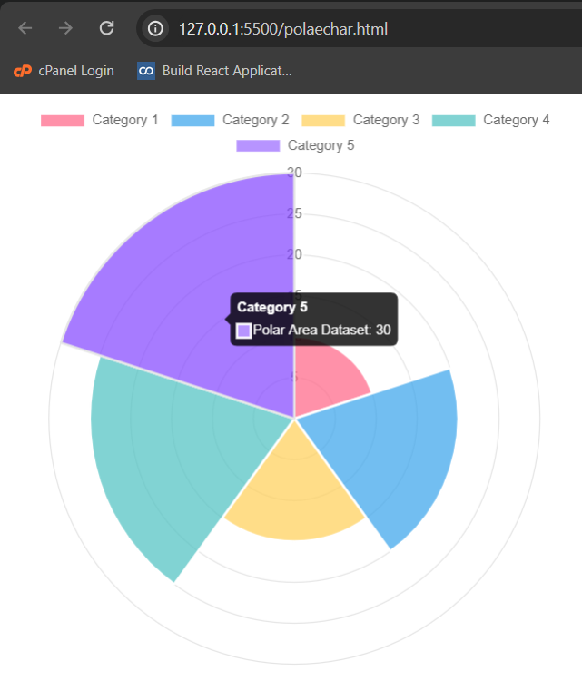
Polar Area Chart
Similar to a standard area chart but displayed in a polar coordinate system, with each data point represented by a segment of a circle.
Use Case: Visualizing cyclical patterns in data.
 const polarAreaData = {
  labels: ['Category 1', 'Category 2', 'Category 3', 'Category 4', 'Category 5'],
  datasets: [
    {
      label: 'Polar Area Dataset',
      data: [10, 20, 15, 25, 30],
      backgroundColor: [
        'rgba(255, 99, 132, 0.7)',
        'rgba(54, 162, 235, 0.7)',
        'rgba(255, 206, 86, 0.7)',
        'rgba(75, 192, 192, 0.7)',
        'rgba(153, 102, 255, 0.7)',
      ],
      borderColor: 'rgba(255, 255, 255, 1)', // Border color of each segment
      borderWidth: 2,
    },
  ]
};
const polarAreaCanvas = document.getElementById('polarAreaChartCanvas');
const polarAreaChart = new Chart(polarAreaCanvas, {
  type: 'polarArea',
  data: polarAreaData,
  options: {
    scale: {
      ticks: {
        beginAtZero: true,
      },
    },
  },
});
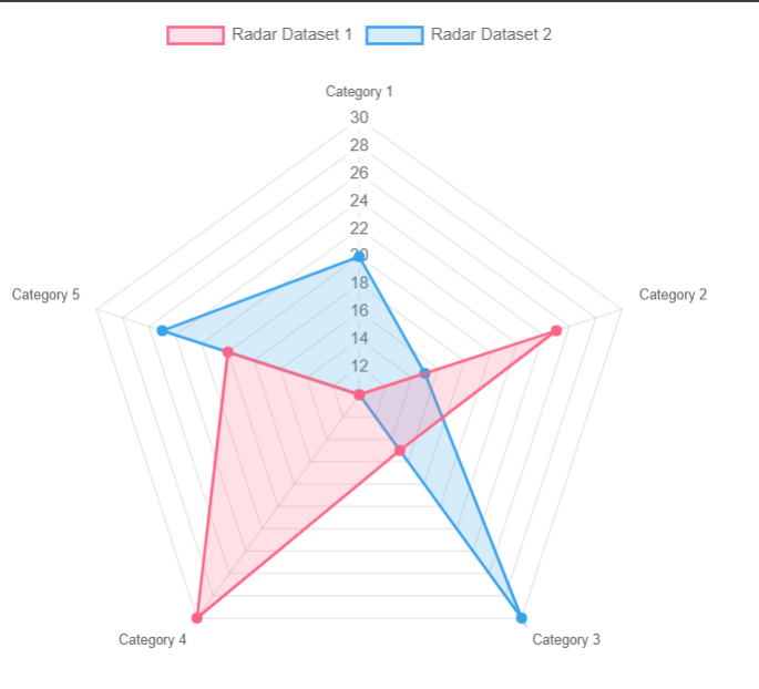
Radar Chart
Radar charts, also known as spider or web charts, represent data in a two-dimensional chart where three or more quantitative variables are represented on axes starting from the same point
const radarData = {
  labels: ['Category 1', 'Category 2', 'Category 3', 'Category 4', 'Category 5'],
  datasets: [
    {label: 'Radar Dataset 1',
      data: [10, 25, 15, 30, 20],
      backgroundColor: 'rgba(255, 99, 132, 0.2)', // Fill color
      borderColor: 'rgba(255, 99, 132, 1)', // Border color
      borderWidth: 2,
      pointBackgroundColor: 'rgba(255, 99, 132, 1)', // Point color
    },
    {
      label: 'Radar Dataset 2',
      data: [20, 15, 30, 10, 25],
      backgroundColor: 'rgba(54, 162, 235, 0.2)',
      borderColor: 'rgba(54, 162, 235, 1)',
      borderWidth: 2,
      pointBackgroundColor: 'rgba(54, 162, 235, 1)',
    },
  ]
};
const radarCanvas = document.getElementById('radarChartCanvas');
const radarChart = new Chart(radarCanvas, {
  type: 'radar',
  data: radarData,
  options: {
    scale: {
      ticks: {
        beginAtZero: true,
        max: 40,  },
    },
  },
});
Scatter Chart
Scatter charts use Cartesian coordinates to display individual data points as markers. The position of each point is determined by its x and y values.
const scatterData = {
  datasets: [
    {
      label: 'Scatter Dataset 1',
      data: [
        { x: 10, y: 20 },
        { x: 15, y: 25 },
        { x: 20, y: 30 },
        { x: 25, y: 35 },
        { x: 30, y: 40 },
      ],
      backgroundColor: 'rgba(255, 99, 132, 0.7)',
      borderColor: 'rgba(255, 99, 132, 1)',
      borderWidth: 2,
    },
    {
      label: 'Scatter Dataset 2',
      data: [
        { x: 5, y: 15 },
        { x: 12, y: 28 },
        { x: 18, y: 22 },
        { x: 24, y: 36 },
        { x: 32, y: 45 },
      ],
      backgroundColor: 'rgba(54, 162, 235, 0.7)',
      borderColor: 'rgba(54, 162, 235, 1)',
      borderWidth: 2,
    },
  ]
};


const scatterCanvas = document.getElementById('scatterChartCanvas');
const scatterChart = new Chart(scatterCanvas, {
  type: 'scatter',
  data: scatterData,
  options: {
    scales: {
      x: {
        type: 'linear', // Type of x-axis (linear for numerical values)
        position: 'bottom',
      },
      y: {
        type: 'linear', // Type of y-axis (linear for numerical values)
        position: 'left',
      },
    },
  },
});
Axes
Axes are an integral part of a chart. They are used to determine how data maps to a pixel value on the chart.
Let's go through examples and explanations for different types of axes commonly used in charting libraries, specifically focusing on Cartesian (linear, logarithmic, and time-based) and radial axes. We'll also cover category axes, which are often used for categorical data.
1. Cartesian Axes
In the context of charts, a Cartesian axis is a coordinate axis system that uses two perpendicular axes, usually labelled as the x-axis and y-axis, to represent data points in a two-dimensional space.
In a cartesian chart, there is 1 or more X-axis and 1 or more Y-axis to map points onto the 2-dimensional canvas. These axes are known as 'cartesian axes'.
const lineChart = new Chart(ctx, {
      type: 'line',
      data: {
        labels: months,
        datasets: [{
          label: 'Monthly Sales',
          data: salesData,
          borderColor: 'blue',
          backgroundColor: 'rgba(0, 0, 255, 0.2)',
        }],
      },
      options: {
        scales: {
          x: {
            type: 'category',
            title: {
              display: true,
              text: 'Months',
            },
          },
          y: {
            title: {
              display: true,
              text: 'Sales',
            },
          },
        },
      },
    });
The scales property in the options section is used to configure the x-axis and y-axis. The type: 'category' specifies that the x-axis is categorical (representing labels), and the type: 'linear' is used for a numerical axis. The title property is used to add labels to the axes.
2. Category Axis
Category axes in Chart.js are used when dealing with categorical data, such as labels or names of categories, instead of numerical values.
Category axes are often used in bar charts, line charts, radar charts, and other types of charts where the data points are distinct categories rather than continuous numerical values.
    const ctx = document.getElementById('barChart').getContext('2d');
    const barChart = new Chart(ctx, {
      type: 'bar',
      data: barData,
      options: {
        scales: {
          x: {
            type: 'category', // X-axis type (category for labels)
            position: 'bottom', // Position of the axis
          },
          y: {
            type: 'linear', // Y-axis type (linear for numerical values)
            position: 'left',
          },
        },
      },
    });
3.Logarithmic Axis
A logarithmic axis is useful when dealing with data that spans multiple orders of magnitude, providing a better representation of both small and large values.
const logarithmicChart = new Chart(ctx, {
  type: 'line',
  data: {
    labels: ['1', '10', '100', '1000', '10000'],
    datasets: [{
      label: 'Logarithmic Data',
      data: [1, 10, 100, 1000, 10000],
      borderColor: 'green',
      backgroundColor: 'rgba(0, 255, 0, 0.2)',
    }],
  },
  options: {
    scales: {
      x: {
        type: 'category',
        title: {
          display: true,
          text: 'Values',
        },
      },
      y: {
        title: {
          display: true,
          text: 'Logarithmic Scale',
        },
        type: 'logarithmic',
        position: 'left',
      },
    },
  },
});
The time cartesian axis is used for representing time-based data.
const timeChart = new Chart(ctx, {
  type: 'line',
  data: {
    labels: ['2022-01-01', '2022-02-01', '2022-03-01', '2022-04-01'],
    datasets: [{
      label: 'Time Series Data',
      data: [50, 80, 65, 95],
      borderColor: 'purple',
      backgroundColor: 'rgba(128, 0, 128, 0.2)',
    }],
  },
  options: {
    scales: {
      x: {
        type: 'time',
        time: {
          unit: 'month',
        },
        title: {
          display: true,
          text: 'Time',
        },
      },
      y: {
        title: {
          display: true,
          text: 'Values',
        },
      },
    },
  },
});
4. Radial Axes
Radial axes are unique in that they are specifically designed for radar and polar area chart types. Unlike Cartesian axes, which are typically positioned along the edges of a chart, radial axes overlay the chart area and emanate from the center in a radial fashion. They are well-suited for visualizing data in a circular or radial context, such as radar charts that display multivariate data.
In the context of Chart.js, which is a popular JavaScript charting library, a radar chart consists of a set of axes radiating from the center, each representing a different variable or category. The values for each variable are plotted along the corresponding axis, forming a shape that conveys the relationships between variables.
scales: {
  r: {
    type: 'linear',     min: 0,
    max: 100,
  },
}
5. Labeling Axes
It allows to Customize the axis labels to provide additional information and context to the viewer.
scales: {
x: {
type: 'linear',
title: {
display: true,
text: 'X-Axis Label',
},
},
y: {
type: 'linear',
title: {
display: true,
text: 'Y-Axis Label',
},
},
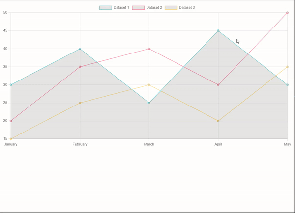
}Styling
It allows to Apply styles to axes, gridlines, ticks, and other elements to enhance the visual appearance of the chart.
<canvas id="areaChartCanvas" width="400" height="200"></canvas>
<script>
const areaData = {
  labels: ['January', 'February', 'March', 'April', 'May'],
  datasets: [
    {
      label: 'Dataset 1',
      data: [30, 40, 25, 45, 30],
      borderColor: 'rgba(75, 192, 192, 1)',
      borderWidth: 1,
      fill: 'origin',
    },
    {
      label: 'Dataset 2',
      data: [20, 35, 40, 30, 50],
      borderColor: 'rgba(255, 99, 132, 1)',
      borderWidth: 1,
      fill: 1,
    },
    {
      label: 'Dataset 3',
      data: [15, 25, 30, 20, 35],
      borderColor: 'rgba(255, 206, 86, 1)',
      borderWidth: 1,
      fill: '+2',
    },
  ]
};
const areaCanvas = document.getElementById('areaChartCanvas');
const areaChart = new Chart(areaCanvas, {
  type: 'line',
  data: areaData,
});
</script>
Chart with styling demo will be shown as below:
All the examples code are available in the github repo for your reference.
Demos of all charts are available together at one snapshot.
Conclusion
In this article, we have explained about various chart types and its implementation. Charts are the best to present data and Chart JS is one of the best library to use.
Happy Coding.