Create Basic Charts with ChartJS

In the world of data visualization, charts play a pivotal role in conveying information in a visually appealing and easily understandable manner. Charting libraries simplify the process of creating various types of charts, enabling developers to showcase data trends, comparisons, and distributions effectively. One such popular library is Chart.js. In this article, we will explore the process of selecting a charting library and dive into creating basic charts, including line graphs, pie charts, and bar graphs, using Chart.js.
Why Choose Chart.js?
Before diving into the code, let's briefly discuss why Chart.js is a strong contender among charting libraries. Chart.js is an open-source JavaScript library that offers an intuitive and responsive way to create a wide range of charts. Here are a few reasons to consider using Chart.js for your charting needs:
Ease of Use: Chart.js provides a simple and easy-to-understand API, making it suitable for both beginners and experienced developers.
Variety of Chart Types: Chart.js supports a diverse set of chart types, from basic line graphs to more complex radar and bubble charts.
Responsive Design: The library is designed to create charts that adapt to different screen sizes, ensuring a consistent user experience across devices.
Customization: Chart.js allows you to customize various aspects of your charts, including colors, fonts, and labels, to match your design and branding.
Interactivity: Charts created with Chart.js are interactive by default, enabling users to hover over data points for details and interact with the data.
Getting Started:
To start using Chart.js, you need to include its script in your HTML file. You can either download the library or link to a CDN. Let's see how to set up Chart.js in your project:
<!DOCTYPE html>
<html>
<head>
<title>Chart.js Example</title>
<script src="https://cdn.jsdelivr.net/npm/chart.js"></script>
</head>
<body>
<!-- Your chart canvas will be placed here -->
</body>
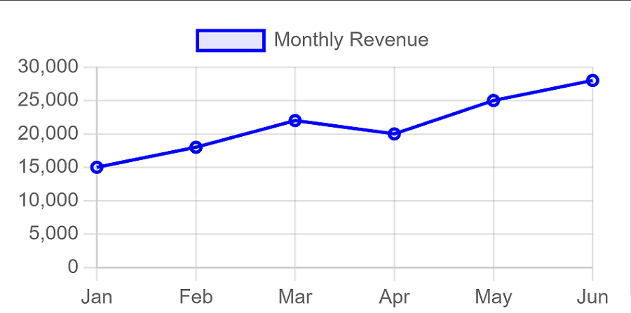
</html>Creating a Line Graph:
A line graph is ideal for showing trends and changes over time. Let's create a simple line graph that depicts the monthly revenue of a fictional company.
// HTML: Add a canvas element where the chart will be rendered
<canvas id="revenueChart"></canvas>
// JavaScript: Create the line chart
<script>
const ctx = document.getElementById('revenueChart').getContext('2d');
const revenueChart = new Chart(ctx, {
type: 'line',
data: {
labels: ['Jan', 'Feb', 'Mar', 'Apr', 'May', 'Jun'],
datasets: [{
label: 'Monthly Revenue',
data: [15000, 18000, 22000, 20000, 25000, 28000],
borderColor: 'blue',
backgroundColor: 'rgba(0, 0, 255, 0.1)',
borderWidth: 2,
}]
},
options: {
responsive: true,
scales: {
y: {
beginAtZero: true
}
}
}
});
</script>After successfully using this code the graph will look something like:
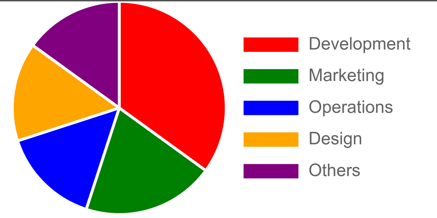
Creating a Pie Chart:
Pie charts are great for displaying the composition of a whole in terms of percentages. Let's create a pie chart to represent the distribution of expenses for a project.
// HTML: Add a canvas element where the chart will be rendered
<canvas id="expensesChart"></canvas>
// JavaScript: Create the pie chart
<script>
const ctx = document.getElementById('expensesChart').getContext('2d');
const expensesChart = new Chart(ctx, {
type: 'pie',
data: {
labels: ['Development', 'Marketing', 'Operations', 'Design', 'Others'],
datasets: [{
data: [35, 20, 15, 15, 15],
backgroundColor: ['red', 'green', 'blue', 'orange', 'purple'],
}]
},
options: {
responsive: true,
plugins: {
legend: {
position: 'right'
}
}
}
});
</script>After successfully using this code the pie chart will look something like:
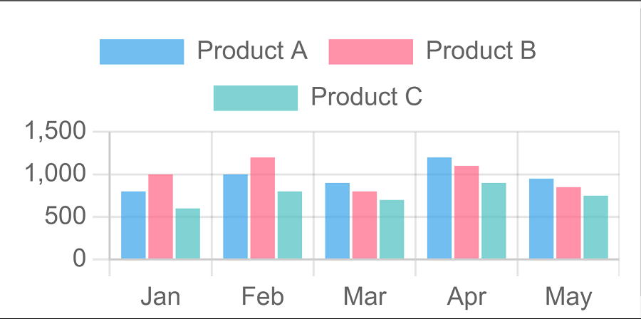
Creating a Bar Graph:
Bar graphs are effective for comparing quantities across different categories. Let's create a bar graph that illustrates the sales performance of different products.
// HTML: Add a canvas element where the chart will be rendered
<canvas id="salesChart"></canvas>
// JavaScript: Create the bar graph
<script>
const ctx = document.getElementById('barChart').getContext('2d');
const barChart = new Chart(ctx, {
type: 'bar',
data: {
labels: ['Jan', 'Feb', 'Mar', 'Apr', 'May'],
datasets: [
{
label: 'Product A',
data: [800, 1000, 900, 1200, 950],
backgroundColor: 'rgba(54, 162, 235, 0.7)',
},
{
label: 'Product B',
data: [1000, 1200, 800, 1100, 850],
backgroundColor: 'rgba(255, 99, 132, 0.7)',
},
{
label: 'Product C',
data: [600, 800, 700, 900, 750],
backgroundColor: 'rgba(75, 192, 192, 0.7)',
},
],
},
options: {
responsive: true,
scales: {
y: {
beginAtZero: true,
},
},
},
});
</script>After successfully using this code the bar graph will look something like:
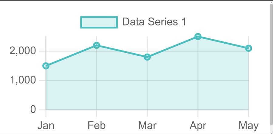
Creating a Area Chart:
The area chart is suitable for visualizing data trends over time, similar to the line chart but with the area under the line filled.
// HTML: Add a canvas element where the chart will be rendered
<canvas id="areaChart"></canvas>
// JavaScript: Create the area chart
<script>
      const ctx = document.getElementById('areaChart').getContext('2d');
      const areaChart = new Chart(ctx, {
        type: 'line',
        data: {
          labels: ['Jan', 'Feb', 'Mar', 'Apr', 'May'],
          datasets: [
            {
              label: 'Data Series 1',
              data: [1500, 2200, 1800, 2500, 2100],
              borderColor: 'rgba(75, 192, 192, 1)',
              backgroundColor: 'rgba(75, 192, 192, 0.2)',
              borderWidth: 2,
              fill: true,
            },
          ],
        },
        options: {
          responsive: true,
          scales: {
            y: {
              beginAtZero: true,
            },
          },
        },
      });
    </script>
After successfully using this code the area chart will look something like:
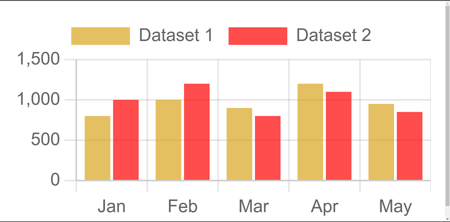
Creating a Mixed Chart:
The mixed chart allows you to combine multiple chart types in a single visualization, enabling you to present diverse datasets in a unified manner.
// HTML: Add a canvas element where the chart will be rendered
<canvas id="mixedChart"></canvas>
// JavaScript: Create the mixed chart
<script>
const ctx = document.getElementById('mixedChart').getContext('2d');
const mixedChart = new Chart(ctx, {
type: 'bar',
data: {
labels: ['Jan', 'Feb', 'Mar', 'Apr', 'May'],
datasets: [
{
label: 'Dataset 1',
data: [800, 1000, 900, 1200, 950],
backgroundColor: 'rgba(218, 165, 32, 0.7)', // Golden color
},
{
label: 'Dataset 2',
data: [1000, 1200, 800, 1100, 850],
backgroundColor: 'rgba(255, 0, 0, 0.7)', // Red color
},
],
},
options: {
responsive: true,
scales: {
y: {
beginAtZero: true,
},
},
},
});
</script>
After successfully using this code the mixed chart will look something like:
Conclusion:
In this article we came to know what chartjs is why we use it and the advantages of chartjs, we also covered how we can use chart js to create line chart, pie charts, bar graph, area chart and mixed graphs. We also displayed with the help of image how will the output look. Whether you're a new or an experienced developer, Chart.js is a valuable tool to have in your arsenal. Happy Coding!
Source code available in Github.