Data Visualization Using Tremor React Library

JavaScript makes it very easy to create well-structured charts and graphs that can be very engaging and time-consuming to visualize data. Because of this, the web industry has been forced to settle for licensed libraries such as Fusion chart, which can be expensive and overkill for small projects. Despite its simplicity, Tremor is a powerful library. In this article, we're going to explain how to use the library, how to set it up, and why you should consider using it.
What is the working mechanism of Tremor?
Tremor is designed for fast dashboard development for data visualization. By default, it comes with beautiful, easy-to-customize components. The Tremor components provide you with everything you need to create amazing-looking dashboards using TypeScript. Tremor's simplicity is further extended by passing tailwind classes as props to components. Tremor also has Blocks in addition to components. Blocks are groups of Tremor components assembled to form a specific layout. Using the block, you will be able to generate the layouts you need most often.
Let's start by creating a React application using Vite. With Vite, you can create almost any web application in seconds. To start, create an empty folder titled "Tremor-Project" in a convenient location of your choice. Using the shortcut key Ctrl+Shift+/, you can open the VScode editor and its integrated terminal.
Use the terminal to navigate to our newly created "Tremor-Project" folder and run the command below.
npm create vite@latest
During the Vite installation wizard, you will be prompted for the project and package names. Give your project a name of your choice. Let's call it "tremor-project" and use the same package name as the project name as the package name. You will then have the option to select the framework you wish to use from the prompt below.
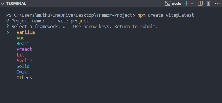
We will be working with React, so navigate to the React option through the up and down arrow keys. The tool follows up by asking which variant of React you would like to use, as shown below.
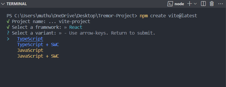
JavaScript will be used, but TypeScript can be used if you are more comfortable with it. Once you select JavaScript, you will see the final prompt below.
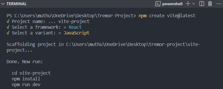
Run the following command from the prompt after navigating to your project via the cd command.
npm install
This command will install all the React files you need.
We will install the Tremor library as a dependency for our project using the following command.
npm install @tremor/react
Let's start up our local server once the installation is complete so we can view the application. To start the server, run the following command.
npm run devA locally hosted server will be created, and you will be given a URL link to its location on the terminal. Visit the link to view your application in your favorite browser.

Tremor component
The Tremor library stands out for its ability to create data visualization dashboards quickly and easily. As a result, you won't have to worry about learning how to style a given chart element or calibrate a bar graph. To create great visuals, you import out-of-the-box components and pass data to them as props. With these intuitive components, you can easily customize them to meet your needs. Open the app.jsx file inside the src folder and clear everything inside the parent div. All imports at the top except app.css should also be cleared. Let's start with a simple Card component. Using the code below, we will import it from Tremor.
import { Card } from "@tremor/react";
After that, import the tremor.css file, which styles out all Tremor components.
import "@tremor/react/dist/esm/tremor.css";If you fail to import this in app.jsx or app.tsx, your components will not be styled. In cases where you have many CSS files, make sure the import is at the bottom.
import { Card, Text } from "@tremor/react";
import "./App.css";
import "@tremor/react/dist/esm/tremor.css";
function App() {
  return (
    <div className="App">
      <Card> </Card>
    </div>
  );
}
export default App;
Your application will render out as follows when you use the Card component.

You don't see anything creative here, but that's how simple Tremor is; components are imported, data is passed in, and the data is rendered out. Besides the Card component, Tremor has a large collection of other components. We shall be going through some of them but also checkout their documentation. Now, Let’s use more components to add complexity to our application. Have the below line in your app.jsx file.
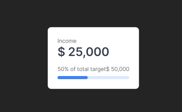
function App() {
  return (
    <Card maxWidth="max-w-sm">
      <Text>Income</Text>
      <Metric>$ 25,000</Metric>
      <Flex marginTop="mt-4">
        <Text>50% of target</Text>
        <Text>$ 50,000</Text>
      </Flex>
      <ProgressBar percentageValue={50} marginTop="mt-2" />
    </Card>
  );
}
export default App;
These few lines of code result in the following visual.
Designing a dashboard
The Tremor platform provides example layouts known as page shell blocks. We can quickly wrap visualizations and metrics into visually appealing dashboard interfaces with these shell blocks without worrying about layout constraints, such as responsiveness.
To begin, we will use the Tremor shell pages to have a responsive design quickly. We use the page shell for our design, but we will add a few minor tweaks. For your app.jsx, you can have the following line of code.
File: component/dashboard.jsx
import { Card, Title, Text, Tab, TabList, ColGrid, Block } from "@tremor/react";

import Salary from "./area-chart";
import City from "./donut-chart";
import BarChart from "./bar-chart";
import BarList from "./bar-list";
import ProgressBar from "./progress-bar";

export default function Example() {
  return (
    <main>
      <Title>Dashboard</Title>
      <ColGrid
        numColsMd={2}
        numColsLg={3}
        gapX="gap-x-6"
        gapY="gap-y-6"
        marginTop="mt-6"
      >
        <Card>
          {/* Placeholder to set height */}
          <City />
        </Card>
        <Card>
          {/* Placeholder to set height */}
          <Salary />
        </Card>
        <Card>
          {/* Placeholder to set height */}
          <BarChart />
        </Card>
        <Card>
          {/* Placeholder to set height */}
          <BarList />
        </Card>
        <Card>
          {/* Placeholder to set height */}
          <ProgressBar />
        </Card>
      </ColGrid>
    </main>
  );
}
To lay out our children's components, we used the ColGrid Tremor component. Our maximum width is 5, which is shared equally by its direct children in a ratio of 2 to 3. We have also imported some components from a component folder and rendered them out.
In your app.jsx file place below code
File: app.jsx
import Dashboard from "./components/dashboard";
function App() {
  return (
    <div className="p-14 bg-[#F9FAFB]">
      <Dashboard />
    </div>
  );
}

export default App;
In the 'src' folder, create a new folder called Components. Inside the Components folder, create the following components area-chart.jsx, bar-chart.jsx, bar-list.jsx, and progress-bar.jsx, donut-chart.jsx
Area Chart Component
An area chart will be used to visualize the quantitative data graphically in this component. The area-chart.jsx file should have the following lines of code. To show the change in data over time, AreaChart combines a line chart with a bar chart.
File: component/area-chart.jsx
import { Card, Title, AreaChart } from "@tremor/react";
const chartdata = [
  {
    date: "Jan 23 ",
    "Developer Salary": 50000,
    "Tester Salary": 40000,
  },
  {
    date: "Feb 23 ",
    "Developer Salary": 60000,
    "Tester Salary": 50000,
  },
  {
    date: "Mar 23 ",
    "Developer Salary": 40000,
    "Tester Salary": 50000,
  },
  {
    date: "Apr 23 ",
    "Developer Salary": 60000,
    "Tester Salary": 40000,
  },
  {
    date: "May 23 ",
    "Developer Salary": 70000,
    "Tester Salary": 80000,
  },
  {
    date: "Jun 23 ",
    "Developer Salary": 50000,
    "Tester Salary": 40000,
  },
];
const dataFormatter = (number) => {
  return "$ " + Intl.NumberFormat("us").format(number).toString();
};
const Salary = () => (
  <Card height="h-80">
    <Title>Salary over time (USD)</Title>
    <AreaChart
      data={chartdata}
      categories={["Developer Salary", "Tester Salary"]}
      dataKey="date"
      height="h-72"
      colors={["indigo", "cyan"]}
      valueFormatter={dataFormatter}
      marginTop="mt-4"
    />
  </Card>
);
export default Salary;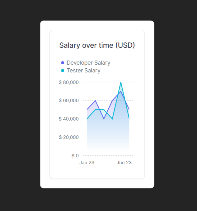
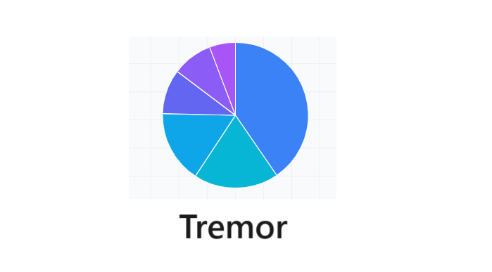
Donut Chart Component
The Tremor Donut chart components will be used in this component to display quantitative information through a circular visualization. It displays data like a pie chart, but it is open at the center like a donut. Using this component, you can pass the color props you want the elements to take with the data and each entry's unique identifier. The donut-chart.jsx file has these lines.
File: component/donut-chart.jsx
import { Card, Title, DonutChart } from "@tremor/react";
const cities = [
  {
    name: "Chennai",
    peopleCount: 50000,
  },
  {
    name: "Madurai",
    peopleCount: 20000,
  },
  {
    name: "Erode",
    peopleCount: 10000,
  },
  {
    name: "Coimbatore",
    peopleCount: 45000,
  },
  {
    name: "Tiruppur",
    peopleCount: 15000,
  },
  {
    name: "Salem",
    peopleCount: 25000,
  },
];
function City() {
  return (
    <div>
      <Card maxWidth="max-w-s">
        <Title>People Count in the City</Title>
        <DonutChart
          data={cities}
          category="peopleCount"
          dataKey="name"
          variant="donut"
          marginTop="mt-6"
          colors={["amber", "rose", "violet", "indigo", "cyan", "indigo"]}
        />
      </Card>
    </div>
  );
}
export default City;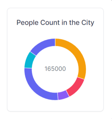
Bar Chart Component
A bar chart will be used to visualize the sales data in this component. A bar chart compares numerical values by using the length of each bar as a measure of value. The bar-chart.jsx file should have the following lines of code.
File: component/bar-chart.jsx
import { Card, Title, BarChart } from "@tremor/react";
const chartdata2 = [
  {
    topic: "Cola",
    "2023 sales": 600,
    "2022 sales": 350,
    "2021 sales": 500,
    "2020 sales": 400,
    "2019 sales": 100,
    "2018 sales": 450,
  },
  {
    topic: "Pepsi",
    "2023 sales": 550,
    "2022 sales": 250,
    "2021 sales": 245,
    "2020 sales": 330,
    "2019 sales": 130,
    "2018 sales": 525,
  },
];
const dataFormatter = (number) => {
  return "$ " + Intl.NumberFormat("us").format(number).toString();
};

function Sales() {
  return (
    <div>
      <Card>
        <Title>Individual products: Entries</Title>
        <BarChart
          data={chartdata2}
          dataKey="topic"
          categories={[
            "2023 sales",
            "2022 sales",
            "2021 sales",
            "2020 sales",
            "2019 sales",
            "2018 sales",
          ]}
          colors={["blue", "teal", "amber", "rose", "indigo", "emerald"]}
          valueFormatter={dataFormatter}
          marginTop="mt-6"
          yAxisWidth="w-12"
        />
      </Card>
    </div>
  );
}
export default Sales;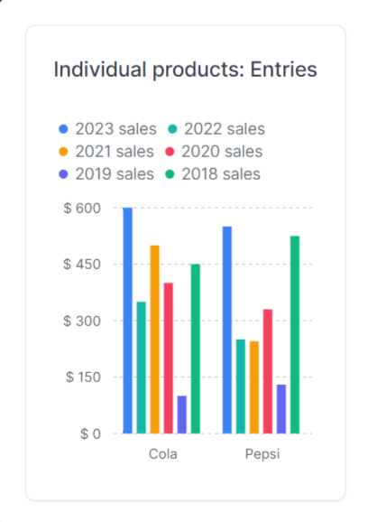
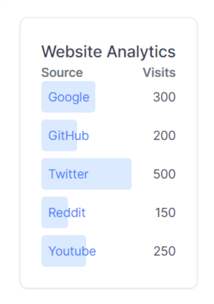
Bar-List Component
In this component, the website visit data will be visualized using a bar list chart. You can combine the component with several other components, such as a Card and a Title component. In addition, you can pass an href that will render your datapoint as a clickable link with target="_blank" and rel="noreferrer".The bar-list.jsx file should have the following lines of code.
File: component/bar-list.jsx
import { BarList, Card, Title, Bold, Flex, Text } from "@tremor/react";
const data = [
  {
    name: "Google",
    value: 300,
    href: "https://google.com",
  },
  {
    name: "GitHub",
    value: 200,
    href: "https://github.com",
  },
  {
    name: "Twitter",
    value: 500,
    href: "https://twitter.com",
  },
  {
    name: "Reddit",
    value: 150,
    href: "https://reddit.com",
  },
  {
    name: "Youtube",
    value: 250,
    href: "https://www.youtube.com",
  },
];
export default () => (
  <Card className="max-w-lg">
    <Title>Website Analytics</Title>
    <Flex className="mt-4">
      <Text>
        <Bold>Source</Bold>
      </Text>
      <Text>
        <Bold>Visits</Bold>
      </Text>
    </Flex>
    <BarList data={data} className="mt-2" />
  </Card>
);
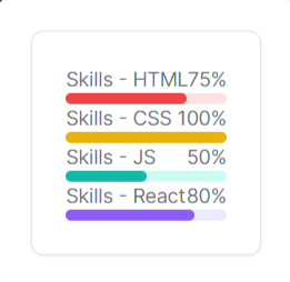
Progress Bar Component
To visualize the skills data in this component, a progress bar will be used. ProgressBar's background color adjusts automatically based on the color selected. Input ranges from 0 to 100, where 100 means 100 percent. The ProgressBar is not displayed if no data is available or the value is zero. The progress-bar.jsx file should have the following lines of code.
File: component/progress-bar.jsx
import { Card, Flex, Text, ProgressBar } from "@tremor/react";
export default () => (
  <Card className="max-w-sm mx-auto">
    <Flex>
      <Text>Skills - HTML</Text>
      <Text>75%</Text>
    </Flex>
    <ProgressBar percentageValue={75} color="red" className="mt-3" />
    <Flex>
      <Text>Skills - CSS</Text>
      <Text>100%</Text>
    </Flex>
    <ProgressBar percentageValue={100} color="yellow" className="mt-3" />
    <Flex>
      <Text>Skills - JS</Text>
      <Text>50%</Text>
    </Flex>
    <ProgressBar percentageValue={50} color="teal" className="mt-3" />
    <Flex>
      <Text>Skills - React</Text>
      <Text>80%</Text>
    </Flex>
    <ProgressBar percentageValue={80} color="violet" className="mt-3" />
  </Card>
);
Conclusion:
Following this article, you must have appreciated how simple and powerful the Tremor library is. Using ready-to-use components, it abstracts you from implementation details. The purpose of this article was to review the Tremor library, how to set it up, and how to use it to visualize data in React.