Mastering the Art of UI Design with Modifiers in Jetpack Compose


A Modifier is an immutable set of transformations that is used to customize the decoration, behavior of a Component in Jetpack Compose.
Modifiers are chainable, meaning they can be combined and applied sequentially to compose complex layouts and behaviors for UI elements. They provide a structured and concise way to define the properties and characteristics of composables, making it easier to create and manage the appearance and functionality of the user interface in a more modular and reusable fashion.
Modifiers allow you to:
- Set size and positioning.
- Apply padding, margins, and spacing.
- Define background colors and shapes.
- Enable interactivity, such as making a composable clickable.
- Implement custom behaviors through the creation of custom modifiers.
Basic Modifier Functions
Here are some basic modifier functions:
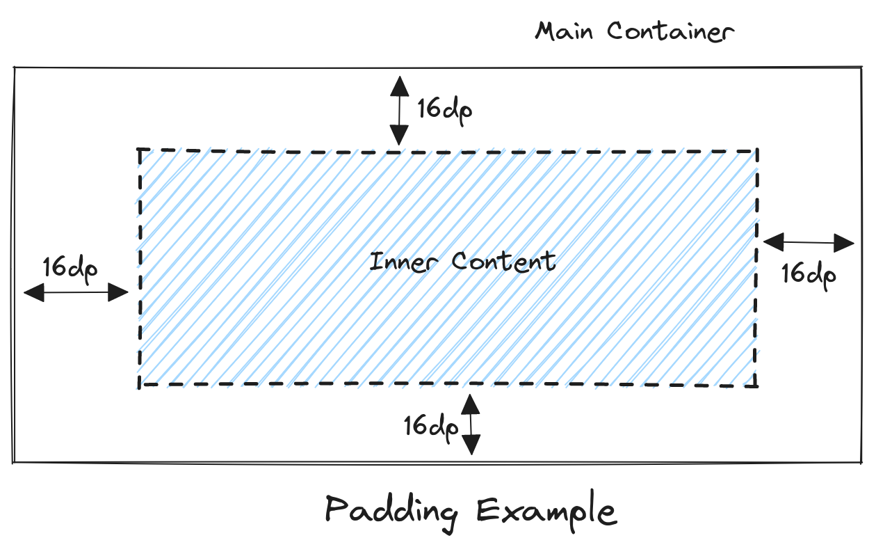
padding():used to apply spacing or padding around a composable element.background():used to set a composable element's background appearance or color. It allows you to specify a background color, a drawable resource, or other background-related properties to customize the visual presentation of the composable.fillMaxSize():used to instruct a composable element to occupy the maximum available space within its parent in width and height dimensions.clickable():used to make a composable element respond to user clicks or touches.border():used to add a border to a composable element. It allows you to define the appearance, color, thickness, and shape of the border around the specified composable, enabling visual distinction and customization of the element's edges.offset():used to adjust the position of a composable element within its layout.align():used to align a composable element within its layout or parent container.weight():used in Jetpack Compose to distribute available space among multiple composables within a Row or Column. It allows for defining the relative proportions or distribution of space that each composable should occupy within the layout.
Custom Modifiers
Developers can create their custom modifiers to archive specific layouts or behavioral effects. First, you have to define a function that takes in a Modifier object and returns a new Modifier object. For example:
fun Modifier.customModifier(backgroundColor: Color, paddingValue: Dp): Modifier = composed {

   this
       .background(color = backgroundColor)
       .padding(paddingValue)

}
Modifier Combinations
Modifier combination allowed the developer to add multiple modifier methods at the same time like:
modifier = Modifier
                 .padding(12.dp)
                 .fillMaxHeight()
As modifiers are chainable, modifiers can be used in complex layouts and behaviors while maintaining readability and reusability within the codebase. This composability allows for dynamic adjustments, facilitating responsive design principles and easier management of user interface elements.
Understanding Modifiers with Examples
After setting up a new project, I removed the total Boilerplate and now the code looks like this:
class MainActivity : ComponentActivity() {

   override fun onCreate(savedInstanceState: Bundle?) {

       super.onCreate(savedInstanceState)

       setContent {

       }

   }

}
Let’s a new function outside of these braces.
@Preview
@Composable
fun ScreenPreview() {
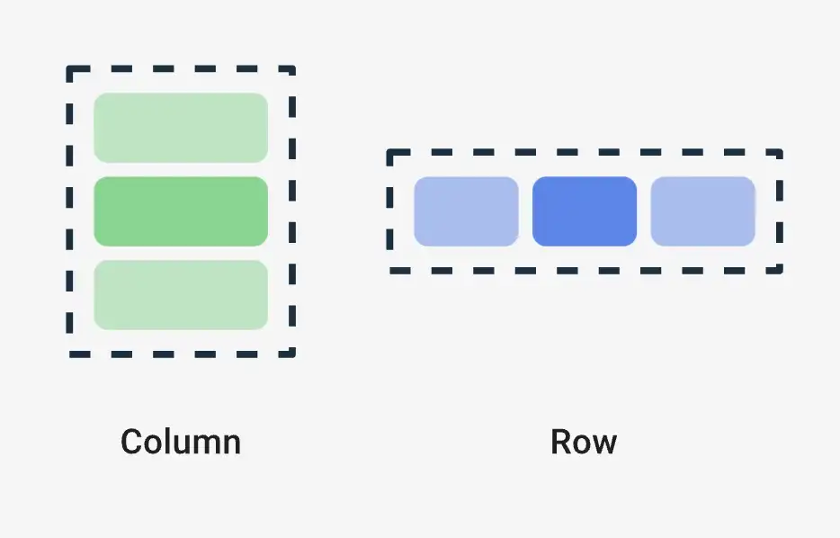
}Remember the easiest way to make the design in Row wise or Column. We’ll do it column-wise.
When incorporating multiple Composable functions within a parent Composable, it is advisable to encapsulate them within a Container, such as a Column or Row, to prevent any unintended collapsing of Composable components.
@Composable defines that the function is composable. And @Preview defines to Android Studio that this function will show as a preview on the Side Screen.
Let's add a modifier to design this Surface. To Preview the Whole screen in a single view we can add Modifier.fillMaxSize(), fillMaxSize contains the whole screen as its meaning stands.
To Turn on the Preview Screen, toggle in the right top “Split” button.
Let's add another composable function named Column. It shows nothing because it just provides a layout.
Add the easiest Composable function text.
Column {

   Text(

       text = "Hello Blackslate",

   )

}
To add a modifier, add another parameter by using a comma.
Some of the most used text modifiers are background, padding, clickable, etc. For font size, font width, and font family text component has parameters you can use.
In the background parameter, you can add the shape of the text, background method adds an extra layer over the text to add the text background, and its shape or size.
Check the below sample:
Text(

   text = "Hello Blackslate",

   modifier = Modifier
       .background(
           Color.Magenta,
           shape = RoundedCornerShape(22.dp)
       )

)
Yeah Preview section looks a little messy, we’ll fix that.
Let's add a padding value after before the background modifier.
modifier = Modifier
   .background(
       Color.Magenta,
       shape = RoundedCornerShape(22.dp)
   )
   .padding(12.dp)
And move the padding value before the background it will look like this
modifier = Modifier
   .padding(12.dp)
   .background(
       Color.Magenta,
       shape = RoundedCornerShape(22.dp)
   )
In the preview you will see what is changing. The modifier UI process will go from top to bottom. So different padding position makes different UI outputs.
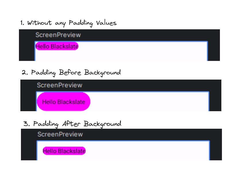
This is What padding looks like
To understand more deeply let's create a profile card.
@Preview
@Composable
fun ProfileCard() {

   Column (
       modifier = Modifier
           .background(Color.White)
   ) {

       Row (
           modifier = Modifier.fillMaxWidth()
       ) {

           Image(
               painter = painterResource(id = R.drawable.profile),
               contentDescription = "Profile Image",
               modifier = Modifier
           )

           Text(
               text = "Arup Basak",
               modifier = Modifier
           )

       }
   }
}
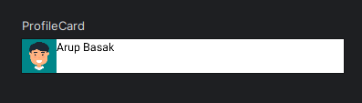
Created a simple boilerplate code. That defines a basic profile card UI, encapsulating an image and text within a white-backgrounded column.
To import Image add an image file in the drawable folder that is in /app/src/main/res/drawable/profile.jpg path, The app folder contains the root folder.
The boilerplate looks like this. To align the code in the center add Alignment.CenterVertically. This will center the Text value in the center. And for the gap between the image and the text, you can add padding in the text. But for better purposes, we can add the spacedBy() method. Arrangement.spacedBy(8.dp). The same code will be for row and vice-versa.
To make the image rounded there is a modifier method named clip that passes the Shape name and writes it.clip(CircleShape)
Now text size looks small, add a parameter fontSize = 18.sp
Here, sp is unit of text size like dp
Final Code:
@Preview
@Composable
fun ProfileCard() {
   Column (
       modifier = Modifier
           .background(Color.White)
   ) {
       Row (
           modifier = Modifier
               .fillMaxWidth()
               .padding(8.dp),
           verticalAlignment = Alignment.CenterVertically,
           horizontalArrangement = Arrangement.spacedBy(8.dp)
       ) {
           Image(
               painter = painterResource(id = R.drawable.profile),
               contentDescription = "Profile Image",
               modifier = Modifier
                   .size(42.dp)
                   .clip(CircleShape)
           )
           Text(
               text = "Arup Basak",
               modifier = Modifier,
               fontSize = 18.sp
           )
       }
   }
}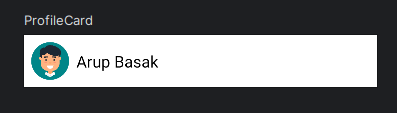
This is UI.
Let add another text, and capsule the text into a column
Column {

   Text(
       text = "Arup Basak",
       modifier = Modifier,
       fontSize = 18.sp,
   )

   Text(
       text = "3 hours ago",
       modifier = Modifier,
       fontSize = 18.sp
   )

}
Added the profile card, like chat user list.
To make the heading a little bold you can add fontWeight = FontWeight.SemiBold
And make it large about 24.sp, and increase the gap size to Arrangement.spacedBy(12.dp).
Let us make it clickable add a clickable method in the main Column.
Column (
   modifier = Modifier
       .background(Color.White)
       .clickable {
           // TODO('ADD FUNCTIONS')
       }
) {
   Row (
       modifier = Modifier
           .fillMaxWidth()
           .padding(8.dp),
       verticalAlignment = Alignment.CenterVertically,
       horizontalArrangement = Arrangement.spacedBy(12.dp)
   ) {
       Image(
           painter = painterResource(id = R.drawable.profile),
           contentDescription = "Profile Image",
           modifier = Modifier
               .size(50.dp)
               .clip(CircleShape)
       )
       Column {
           Text(
               text = "Arup Basak",
               modifier = Modifier,
               fontSize = 24.sp,
               fontWeight = FontWeight.SemiBold
           )
           Text(
               text = "3 hours ago",
               modifier = Modifier,
               fontSize = 18.sp
           )
       }
   }
}
This is the final code.
Conditional Modifier:
You can add conditional statement in the modifier. To add a conditional modifier, you can use the if statement to conditionally apply a modifier based on a certain condition.
@Composable
fun MyConditionalModifier(isError: Boolean) {

modifier = Modifier
   .size(48.dp)
   .clip(CircleShape)
   .background(if (isError) colorResource(id = R.color.red) else colorResource(id = R.color.green))
   .padding(12.dp)

}
Modifier Best Practices
There are essential practices for leveraging Modifiers in Jetpack Compose, setting your app apart.
Use Chaining for Clarity:
Chain modifiers clearly and concisely, considering readability.
Reusable Custom Modifiers:
Create and use custom modifiers for repetitive styling or behavior. It makes code much cleaner
Conditional Modifiers:
Apply modifiers conditionally based on certain criteria. Example:
Box(
   modifier = Modifier
       .size(150.dp)
       .padding(16.dp)
       .background(if (isHighlighted) Color.Yellow else Color.White)
) {

   // Content inside the Box

}
Conclusion
Modifiers in Jetpack Compose are like tools to change how things look and act in your app. By using them in a clear and organized way, you can make your app look great and work smoothly. Following simple rules, like grouping them smartly and naming them well, help you build a cool app easily.