React Native Navigation and Routing with Expo: A Comprehensive Guide


Navigation is a cornerstone of mobile app development, providing users with a seamless and intuitive way to explore and interact with different sections of an application. In the React Native ecosystem, React Navigation stands out as a powerful and flexible library for managing navigation and routing.
In this extensive guide, we will delve into various navigation techniques using React Navigation within the Expo framework. To make things more engaging, we'll build a comprehensive example app covering stack navigation, tab navigation, and even a custom navigator.
To get basics about React Native, refer to our previous posts.
Setting Up the Project with Expo
Before we dive into the intricacies of navigation, let's set up a new Expo project. Ensure you have Expo CLI installed:
npm install -g expo-cli
Now, create a new Expo project:
expo init NavigationExample
cd NavigationExample
Choose the "blank" template for simplicity. Once the project is created, navigate to its directory and install the necessary dependencies:
cd NavigationExample


npm install @react-navigation/native @react-navigation/stack @react-navigation/bottom-tabs react-native-paper react-native-vector-icons
These additional packages, `react-native-paper` for styling and `react-native-vector-icons` for icons, will enhance the visual appeal of our example app.
Stack Navigation
App.js
Let's begin by setting up a simple stack navigator. Stack navigation is a common pattern where screens are organized in a stack, allowing users to navigate forward and backward through the stack.
import React from 'react';
import { NavigationContainer } from '@react-navigation/native';
import { createStackNavigator } from '@react-navigation/stack';

import HomeScreen from './screens/HomeScreen';
import DetailsScreen from './screens/DetailsScreen';

const Stack = createStackNavigator();

export default function App() {
 return (
   <NavigationContainer>
     <Stack.Navigator initialRouteName="Home">
       <Stack.Screen name="Home" component={HomeScreen} />
       <Stack.Screen name="Details" component={DetailsScreen} />
     </Stack.Navigator>
   </NavigationContainer>
 );
}
Explanation:
- `NavigationContainer`: The root component that manages the navigation tree.
- `createStackNavigator`: Creates a stack navigator.
- `Stack.Navigator`: The stack navigator component, where screens are defined.
- `Stack.Screen`: Defines individual screens within the stack.
HomeScreen.js
Now, let's create a basic Home screen component:
import React from 'react';
import { View, Text, Button } from 'react-native';
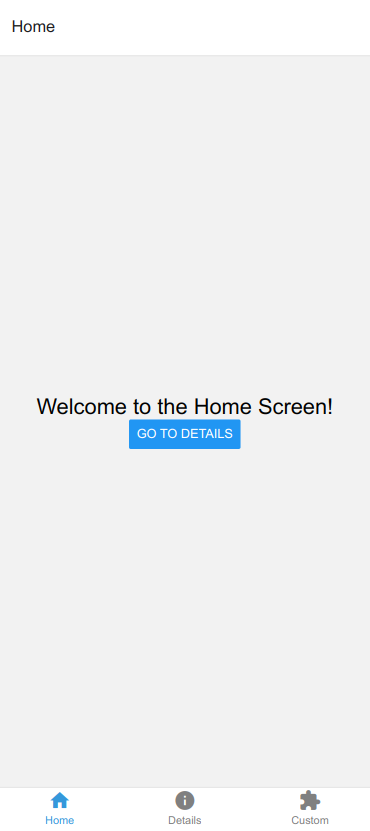
export default function HomeScreen({ navigation }) {
return (
<View style={{ flex: 1, justifyContent: 'center', alignItems: 'center' }}>
<Text style={{ fontSize: 24 }}>Welcome to the Home Screen!</Text>
<Button
title="Go to Details"
onPress={() => navigation.navigate('Details')}
style={{ marginTop: 20 }}
/>
</View>
);
}DetailsScreen.js
And a corresponding Details screen:
import React from 'react';
import { View, Text } from 'react-native';

export default function DetailsScreen() {
 return (
   <View style={{ flex: 1, justifyContent: 'center', alignItems: 'center' }}>
     <Text style={{ fontSize: 24 }}>Details Screen</Text>
   </View>
 );
}
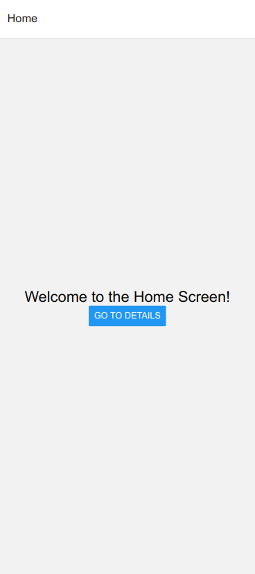
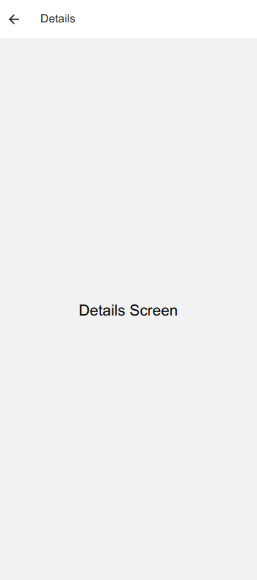
With these simple components, we've set up basic stack navigation.
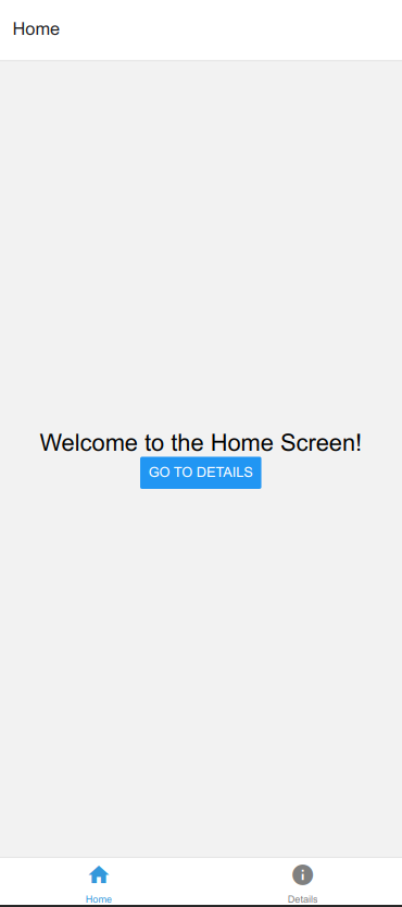
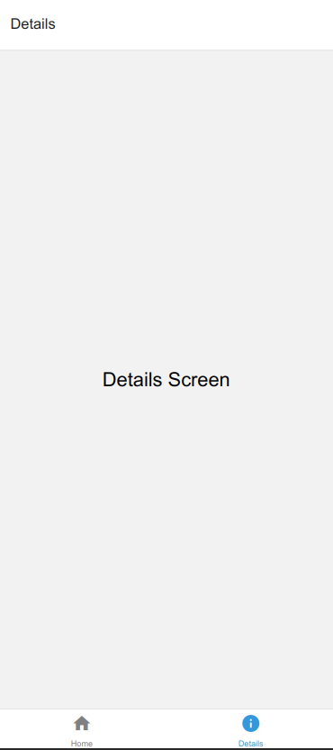
Tab Navigation
Now, let's enhance our app by adding tab navigation. Tab navigation is an effective way to organize an app into different sections.
App.js (updated)
import React from 'react';
import { NavigationContainer } from '@react-navigation/native';
import { createBottomTabNavigator } from '@react-navigation/bottom-tabs';
import { MaterialCommunityIcons } from '@expo/vector-icons';

import HomeScreen from './screens/HomeScreen';
import DetailsScreen from './screens/DetailsScreen';

const Tab = createBottomTabNavigator();

export default function App() {
 return (
   <NavigationContainer>
     <Tab.Navigator
       initialRouteName="Home"
       tabBarOptions={{
         activeTintColor: '#3498db',
         inactiveTintColor: 'gray',
       }}
     >
       <Tab.Screen
         name="Home"
         component={HomeScreen}
         options={{
           tabBarLabel: 'Home',
           tabBarIcon: ({ color, size }) => (
             <MaterialCommunityIcons
               name="home"
               color={color}
               size={size}
             />
           ),
         }}
       />
       <Tab.Screen
         name="Details"
         component={DetailsScreen}
         options={{
           tabBarLabel: 'Details',
           tabBarIcon: ({ color, size }) => (
             <MaterialCommunityIcons
               name="information"
               color={color}
               size={size}
             />
           ),
         }}
       />
     </Tab.Navigator>
   </NavigationContainer>
 );
}
Explanation:
- `createBottomTabNavigator`: Creates a tab navigator.
- `Tab.Navigator`: The tab navigator component.
- `Tab.Screen`: Defines individual screens within the tab navigator.
- `MaterialCommunityIcons`: Icon component from `react-native-vector-icons` for a material design icon set.
This update adds tab navigation with icons to our app.
Custom Navigator
Sometimes, the default navigators may not fully meet our app's needs. In such cases, React Navigation allows us to create custom navigators. Let's create a custom navigator to demonstrate this.
CustomStackNavigator.js
import React from 'react';
import { createStackNavigator } from '@react-navigation/stack';

import CustomScreen from './screens/CustomScreen';

const Stack = createStackNavigator();

export default function CustomStackNavigator() {
 return (
   <Stack.Navigator>
     <Stack.Screen
       name="Custom"
       component={CustomScreen}
       options={{
         title: 'Custom Screen',
         headerStyle: {
           backgroundColor: '#3498db',
         },
         headerTintColor: '#fff',
         headerTitleStyle: {
           fontWeight: 'bold',
         },
       }}
     />
   </Stack.Navigator>
 );
}
App.js (updated)
import React from 'react';
import { NavigationContainer } from '@react-navigation/native';
import { createBottomTabNavigator } from '@react-navigation/bottom-tabs';
import { MaterialCommunityIcons } from '@expo/vector-icons';

import HomeScreen from './screens/HomeScreen';
import DetailsScreen from './screens/DetailsScreen';
import CustomStackNavigator from './CustomStackNavigator';

const Tab = createBottomTabNavigator();

export default function App() {
 return (
   <NavigationContainer>
     <Tab.Navigator
       initialRouteName="Home"
       tabBarOptions={{
         activeTintColor: '#3498db',
         inactiveTintColor: 'gray',
       }}
     >
       <Tab.Screen
         name="Home"
         component={HomeScreen}
         options={{
           tabBarLabel: 'Home',
           tabBarIcon: ({ color, size }) => (
             <MaterialCommunityIcons
               name="home"
               color={color}
               size={size}
             />
           ),
         }}
       />
       <Tab.Screen
         name="Details"
         component={DetailsScreen}
         options={{
           tabBarLabel: 'Details',
           tabBarIcon: ({ color, size }) => (
             <MaterialCommunityIcons
               name="information"
               color={color}
               size={size}
             />
           ),
         }}
       />
       <Tab.Screen
         name="Custom"
         component={CustomStackNavigator}
         options={{
           tabBarLabel: 'Custom',
           tabBarIcon: ({ color, size }) => (
             <MaterialCommunityIcons
               name="puzzle"
               color={color}
               size={size}
             />
           ),
         }}
       />
     </Tab.Navigator>
   </NavigationContainer>
 );
}
Explanation:
- `createStackNavigator`: Creates a stack navigator.
- `Stack.Navigator`: The stack navigator component for our custom screen.
- `Stack.Screen`: Defines individual screens within the stack.
- Options in `CustomStackNavigator`: Customization of the navigation header.
With this setup, we've integrated a custom navigator into our app, showcasing the flexibility of React Navigation.
Styling and Icons
Let's enhance the visual appeal of our app with some styling and icons.
styles.js
Create a file named `styles.js` in the project root:
import { StyleSheet } from 'react-native';

export const globalStyles = StyleSheet.create({
 container: {
   flex: 1,
   justifyContent: 'center',
   alignItems: 'center',
   backgroundColor: '#ecf0f1',
 },
 titleText: {
   fontSize: 24,
   fontWeight: 'bold',
   marginBottom: 20,
 },
 button: {
   marginTop: 20,
 },
});

export const tabStyles = StyleSheet.create({
 tabBarIcon: {
   marginBottom: -3,
 },
});
Explanation:
- `globalStyles`: Contains styling for the overall app layout.
- `tabStyles`: Contains styling for tab bar icons to adjust their positioning.
App.js (updated)
import React from 'react';
import { NavigationContainer } from '@react-navigation/native';
import { createBottomTabNavigator } from '@react-navigation/bottom-tabs';
import { MaterialCommunityIcons } from '@expo/vector-icons';

import HomeScreen from './screens/HomeScreen';
import DetailsScreen from './screens/DetailsScreen';
import CustomStackNavigator from './CustomStackNavigator';
import { globalStyles, tabStyles } from './styles';

const Tab = createBottomTabNavigator();

export default function App() {
 return (
   <NavigationContainer>
     <Tab.Navigator
       initialRouteName="Home"
       tabBarOptions={{
         activeTintColor: '#3498db',
         inactiveTintColor: 'gray',
         labelStyle: {
           fontSize: 12,
           marginBottom: 5,
         },
         style: {
           backgroundColor: '#ecf0f1',
         },
       }}
     >
       <Tab.Screen
         name="Home"
         component={HomeScreen}
         options={{
           tabBarLabel: 'Home',
           tabBarIcon: ({ color, size }) => (
             <MaterialCommunityIcons
               name="home"
               color={color}
               size={size}
             />
           ),
         }}
       />
       <Tab.Screen
         name="Details"
         component={DetailsScreen}
         options={{
           tabBarLabel: 'Details',
           tabBarIcon: ({ color, size }) => (
             <MaterialCommunityIcons
               name="information"
               color={color}
               size={size}
             />
           ),
         }}
       />
       <Tab.Screen
         name="Custom"
         component={CustomStackNavigator}
         options={{
           tabBarLabel: 'Custom',
           tabBarIcon: ({ color, size }) => (
             <MaterialCommunityIcons
               name="puzzle"
               color={color}
               size={size}
             />
           ),
         }}
       />
     </Tab.Navigator>
   </NavigationContainer>
 );
}

Now, our app has a consistent style, and the tab bar icons are properly positioned.
Conclusion
In this comprehensive guide, we've explored various navigation techniques in React Native using React Navigation within the Expo framework. From stack navigation to tab navigation and custom navigators, we've covered it all. The example app we've built incorporates styling and icons for a polished look.
Feel free to adapt this code for your projects and explore the official React Navigation documentation for more advanced features and customization options.
Happy coding!