Understanding React Native Components and UI Elements


When embarking on your journey into React Native development, one of the fundamental concepts to grasp is the use of components and UI elements. Components serve as the foundational building blocks of your mobile app, and gaining a comprehensive understanding of how they work is crucial for creating a rich, responsive user interface.
In this blog, we'll take a deep dive into React Native components, introduce some fundamental UI elements like Form, View, Text, Image, Card, List View and explore the JSX syntax used to structure your app's user interface.
Introduction to Components
In React Native, everything revolves around components. A component can be thought of as a reusable piece of user interface that encapsulates the code and rendering logic for a specific part of the application. Components can range from simple, such as a button or a text input field, to complex, like an entire navigation bar or an entire screen in your app.
The Component Hierarchy
Components in React Native form a hierarchical structure, with a single root component at the top. This root component houses child components, which, in turn, can have their child components, thereby creating a tree-like structure. This component hierarchy is the backbone that defines the structure and layout of your app's user interface.
Imagine your app as a tree. At the root, you have the main component. This main component can branch out into several child components, each serving a specific purpose or displaying particular content. These child components can further branch out into sub-components, creating a complex and interconnected structure that represents your app's UI.
The component hierarchy not only defines the organization of your app but also simplifies the process of managing your app's UI. You can make changes to specific components without affecting the entire application, which promotes modularity and maintainability.
Reusability
One of the most significant advantages of using components is reusability. Once you've created a component, you can employ it in multiple parts of your app or even across different apps. This reusability not only saves development time but also promotes consistency and maintainability.
Think of it this way: if you've crafted a beautifully designed button component with specific functionalities, you can easily reuse this button component throughout your app, ensuring that your app's UI remains consistent and aesthetically pleasing. This approach not only speeds up development but also ensures a coherent user experience.
Basic UI Elements
To create an effective user interface in React Native, you'll work with a variety of basic UI elements, which are essentially pre-built components that handle common user interface elements. Let's explore some of these basic UI elements:
1. View
The `View` component serves as the fundamental building block in React Native. It acts as a container for other UI elements and provides a means to structure and organize your app's layout. You can think of a `View` as a div or a container in web development.
Here's an example of how you can use the `View` component:
import React from 'react';
import { View, Text, StyleSheet } from 'react-native';

const App = () => {
 return (
   <View style={styles.container}>
     <Text>Hello, React Native!</Text>
   </View>
 );
};

const styles = StyleSheet.create({
 container: {
   flex: 1,
   justifyContent: 'center',
   alignItems: 'center',
 },
});

export default App;

In this example, we create a `View` that contains a `Text` component. We apply styles to the `View` to define its appearance and layout.
The `View` component is not only used for organizing the layout but also for creating custom components by combining various UI elements.
2. Text
The `Text` component is your go-to choice for displaying text in your app. It allows you to customize the font, size, color, and other text-related properties to ensure that your text content aligns with your app's design.
Here's a simple example of the `Text` component:
import React from 'react';
import { Text, StyleSheet } from 'react-native';

const App = () => {
 return (
   <Text style={styles.text}>Hello, React Native!</Text>
 );
};

const styles = StyleSheet.create({
 text: {
   fontSize: 24,
   color: 'blue',
 },
});

export default App;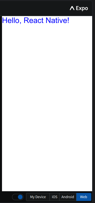
In this example, we create a `Text` component and apply styles to define its appearance. This allows for precise control over how your text is presented, ensuring that it seamlessly integrates with the overall design of your app.
3. Image
The `Image` component is the key to displaying images in your app. It enables you to specify the image source, dimensions, and other properties to ensure your images are presented exactly as intended.
Here's an example of the `Image` component:
import React from 'react';
import { Image, StyleSheet } from 'react-native';

const App = () => {
 return (
   <Image
     source={{ uri: 'https://images.pexels.com/photos/11035363/pexels-photo-11035363.jpeg?auto=compress&cs=tinysrgb&w=1260&h=750&dpr=1' }}
     style={styles.image}
   />
 );
};

const styles = StyleSheet.create({
 image: {
   width: 200,
   height: 200,
 },
});

export default App;
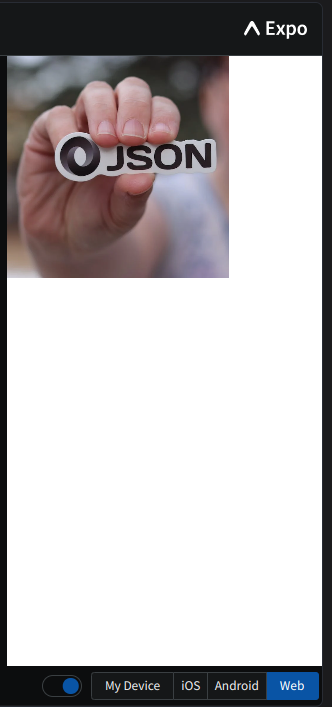
In this example, we create an `Image` component and specify the source image file and its dimensions. This allows you to seamlessly integrate images into your app, whether they are icons, illustrations, or photographs.
These are just a few examples of the basic UI elements you can use in React Native. Each of these components can be customized, combined, and reused to create complex and visually appealing user interfaces.
4. Card
Now, let's introduce the concept of a `Card` component. A card is a common UI element used to display information in a structured format.
It typically contains content such as user profile information.
Here's a simplified example of a Card component:
import React from 'react';
import { View, Text, StyleSheet } from 'react-native';

const Card = () => {
 return (
   <View style={styles.card}>
     <Text style={styles.cardText}>User Profile Information</Text>
     <Text>Name: John Doe</Text>
     <Text>Email: john.doe@example.com</Text>
     {/* Add more user profile details here */}
   </View>
 );
};

const styles = StyleSheet.create({
 card: {
   backgroundColor: 'gray',
   margin: 8,
   padding: 16,
   borderRadius: 8,
   elevation: 3,
 },
 cardText: {
   fontSize: 18,
   fontWeight: 'bold',
 },
});

export default Card;
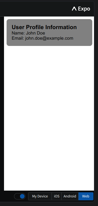
The Card component serves as a container for displaying user profile information. You can customize it to include specific user details.
5. Form
Next, we'll introduce a `Form` component that includes input boxes, checkboxes, and a submit button.
This component is used to capture and interact with user input.
Here's a basic example of a Form component:
import React, { useState } from 'react';
import { View, Text, TextInput, CheckBox, Button, StyleSheet } from 'react-native';

const Form = () => {
 const [text, setText] = useState('');
 const [isChecked, setIsChecked] = useState(false);

 const handleTextChange = (value) => {
   setText(value);
 };

 const handleCheckboxChange = () => {
   setIsChecked(!isChecked);
 };

 const handleSubmit = () => {
   console.log('User Input:', text);
   console.log('Checkbox State:', isChecked);
 };

 return (
   <View style={styles.form}>
     <Text style={styles.label}>Name:</Text>
     <TextInput
       style={styles.input}
       value={text}
       onChangeText={handleTextChange}
     />
     <View style={styles.checkboxContainer}>
       <CheckBox value={isChecked} onValueChange={handleCheckboxChange} />
       <Text style={styles.checkboxLabel}>Check this box</Text>
     </View>
     <Button title="Submit" onPress={handleSubmit} />
   </View>
 );
};

const styles = StyleSheet.create({
 form: {
   backgroundColor: 'gray',
   margin: 8,
   padding: 16,
   borderRadius: 8,
   elevation: 3,
 },
 label: {
   fontSize: 16,
 },
 input: {
   borderBottomWidth: 1,
   marginBottom: 16,
   fontSize: 16,
 },
 checkboxContainer: {
   flexDirection: 'row',
   alignItems: 'center',
   marginBottom: 12,
 },
 checkboxLabel: {
   fontSize: 16,
 },
});

export default Form;
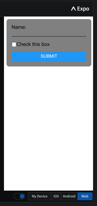
The Form component features text input, a checkbox, and a submit button. When the user interacts with these elements and submits the form, the component logs the user's input and the checkbox's state to the console.
6. List View
A `List View` is a fundamental UI element for showcasing multiple items efficiently.
Here's a simple example of a ListView component:
import React from 'react';
import { View, Text, FlatList, StyleSheet } from 'react-native';

const ListView = () => {
 const data = [
   { id: '1', text: 'Item 1' },
   { id: '2', text: 'Item 2' },
   { id: '3', text: 'Item 3' },
 ];

 const renderItem = ({ item }) => (
   <View style={styles.listItem}>
     <Text>{item.text}</Text>
   </View>
 );

 return (
   <FlatList
     data={data}
     renderItem={renderItem}
     keyExtractor={(item) => item.id}
   />
 );
};

const styles = StyleSheet.create({
 listItem: {
   backgroundColor: 'gray',
   margin: 8,
   padding: 16,
   borderBottomWidth: 1,
   borderColor: 'black',
 },
});

export default ListView;
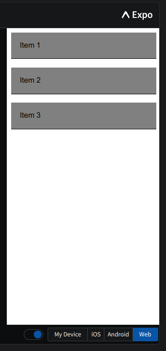
The ListView component displays a list of items with each item being enclosed in a view. This enables you to create scrollable lists of items efficiently.
JSX Syntax
React Native employs JSX (JavaScript XML) syntax to define the structure and layout of your app's user interface. JSX is a JavaScript extension that allows you to write HTML-like code within your JavaScript files, providing a more readable and declarative way to create UI elements.
Here's an example of JSX syntax in React Native:
import React from 'react';
import { View, Text, StyleSheet } from 'react-native';

const App = () => {
 return (
   <View style={styles.container}>
     <Text style={styles.text}>Hello, Black Slate!</Text>
   </View>
 );
};

const styles = StyleSheet.create({
 container: {
   flex: 1,
   justifyContent: 'center',
   alignItems: 'center',
 },
 text: {
   fontSize: 24,
   color: 'red',
 },
});

export default App;
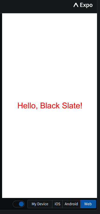
In this code, the JSX syntax is used to create a `View` component containing a `Text` component. You can see how the structure and styling are defined within the JSX code, making it clear and easy to understand.
The use of JSX significantly simplifies the process of designing and rendering user interfaces. It promotes a declarative approach where you describe what your UI should look like, and React Native handles the underlying operations to make it happen. This approach not only enhances the developer experience but also makes the code more maintainable and less error-prone.
Conclusion
A solid understanding of React Native components and basic UI elements is an essential foundation for anyone venturing into mobile app development. Components provide the versatility, reusability, and organization necessary to create robust and user-friendly applications. Basic UI elements such as View, Text, Image, Card, Form, and ListView simplify the process of building user interfaces, which is particularly crucial when creating a weather app.
In the next blog, we'll apply this knowledge to the creation of a Weather App using React Native. We'll explore the integration of APIs to fetch weather data, leveraging the power of components and UI elements to craft a compelling user interface. Additionally, we'll delve deeper into styling, using CSS-in-JS and the `StyleSheet` component to ensure that your weather app not only provides accurate information but also captivates users with its visual appeal.
This blog has provided you with a strong foundation for your journey into React Native development. Stay tuned for more insights and practical tips on crafting a top-notch weather application.
Happy Coding!